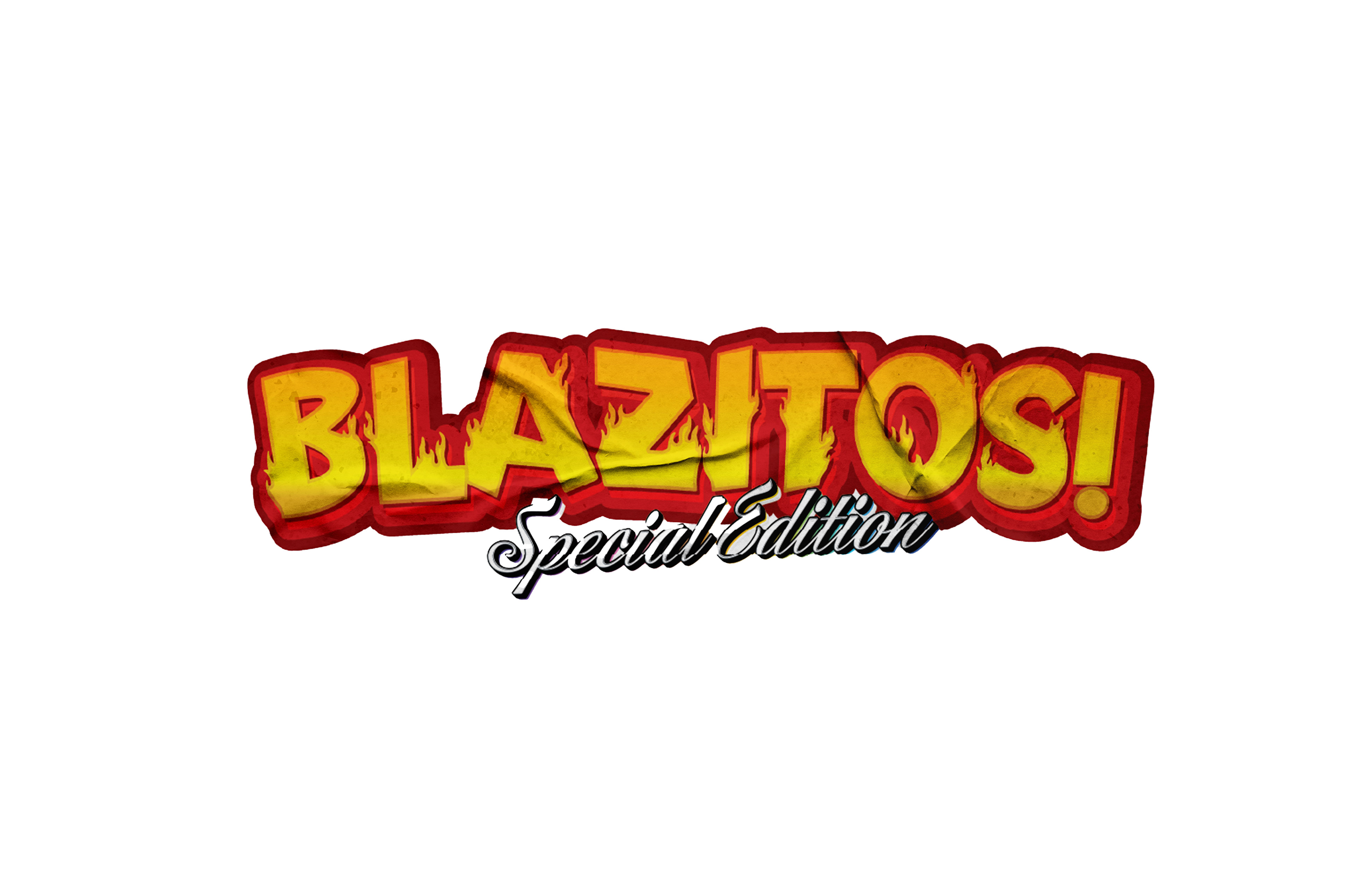
Brand Identity
Blazitos’ identity captures the essence of grit, toughness, and heat. The fiery typography of the logo symbolizes intensity and boldness, while the red and yellow palette reinforces the spicy and adventurous nature of the brand. Inspired by biker culture, the design uses flames, rugged textures, and a rebellious attitude to stand out in the market.
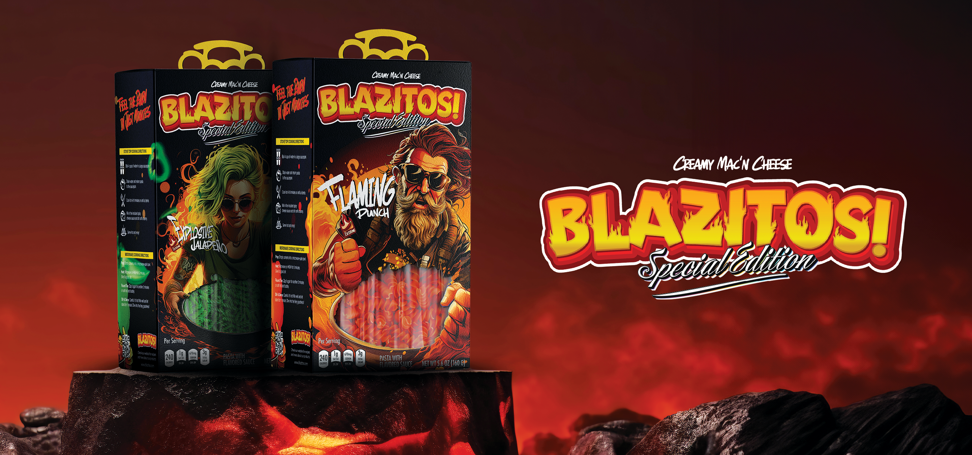
Packaging Design
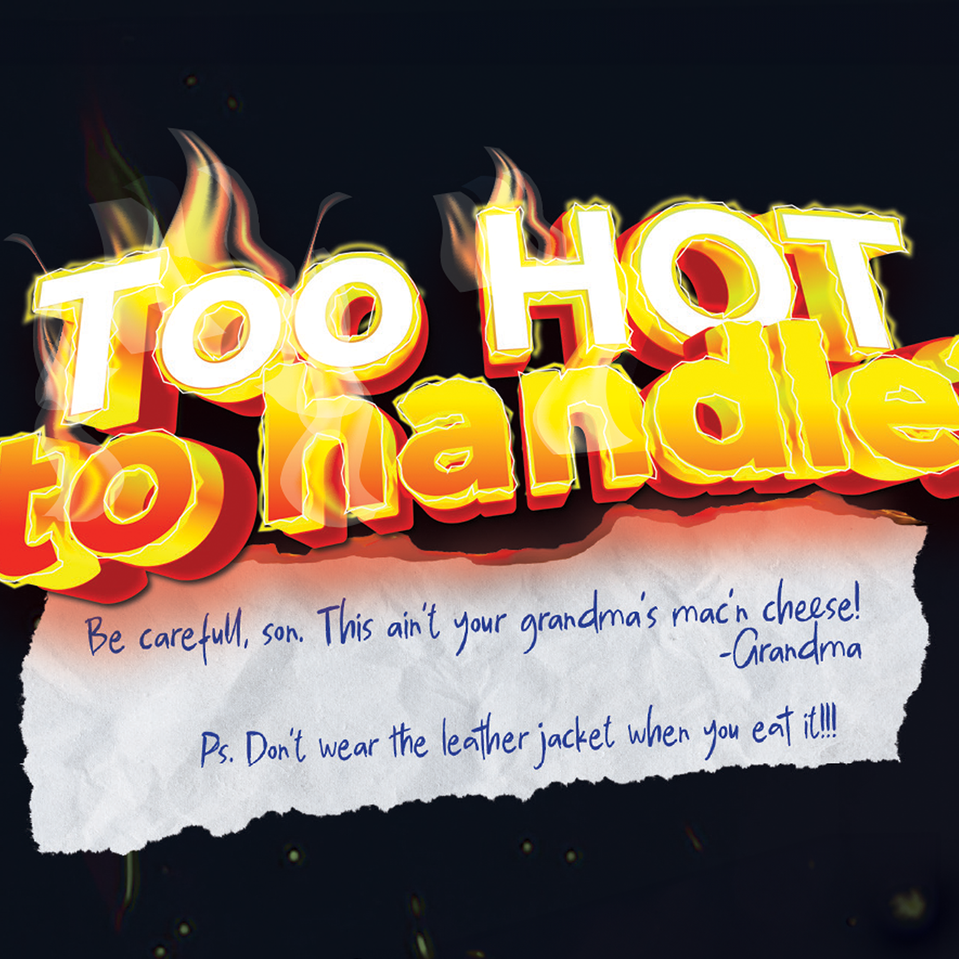
The packaging reflects the brand's daring personality, designed to grab attention and communicate the fiery challenge within. High-contrast visuals, bold warnings like “Too Hot to Handle,” and edgy illustrations highlight the product’s spicy flavors. Each detail—from the striking graphics to the character-driven storytelling—creates a memorable and engaging experience.
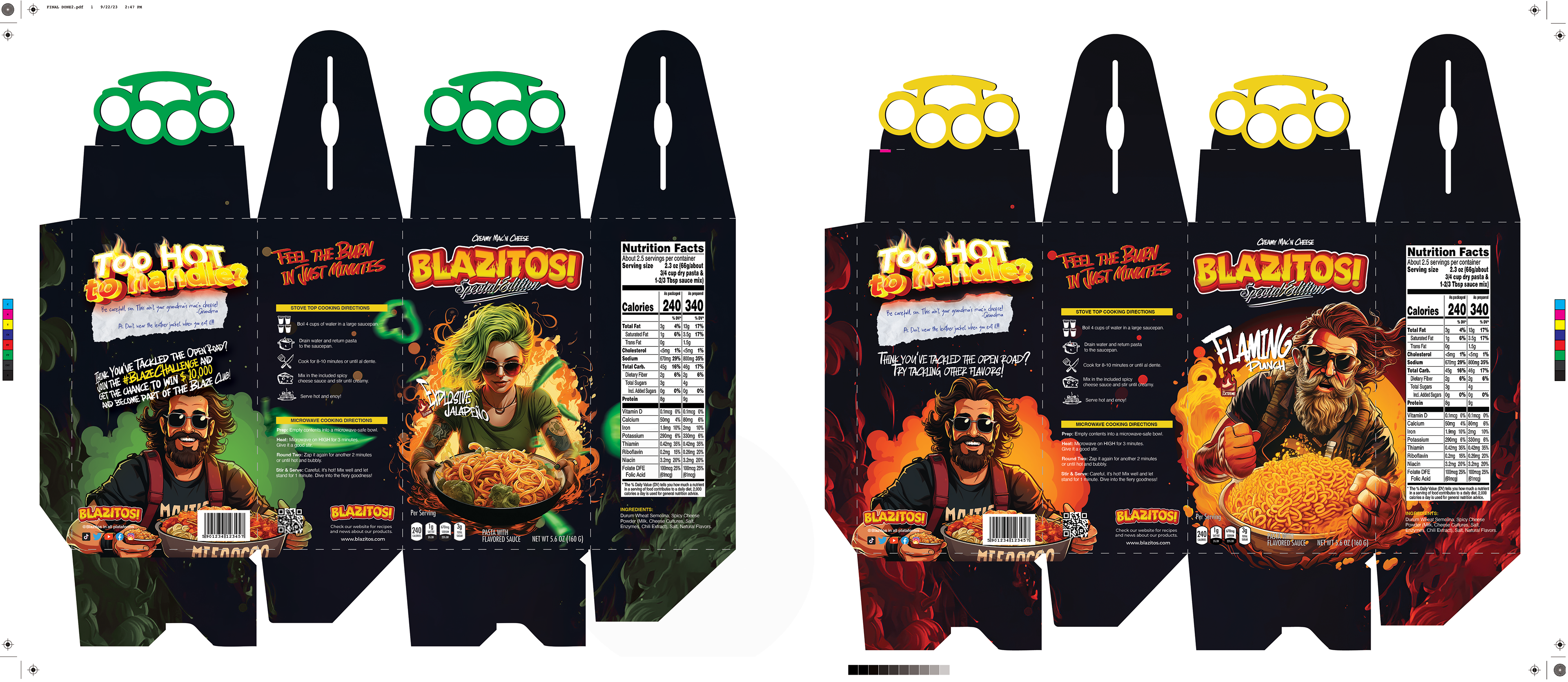
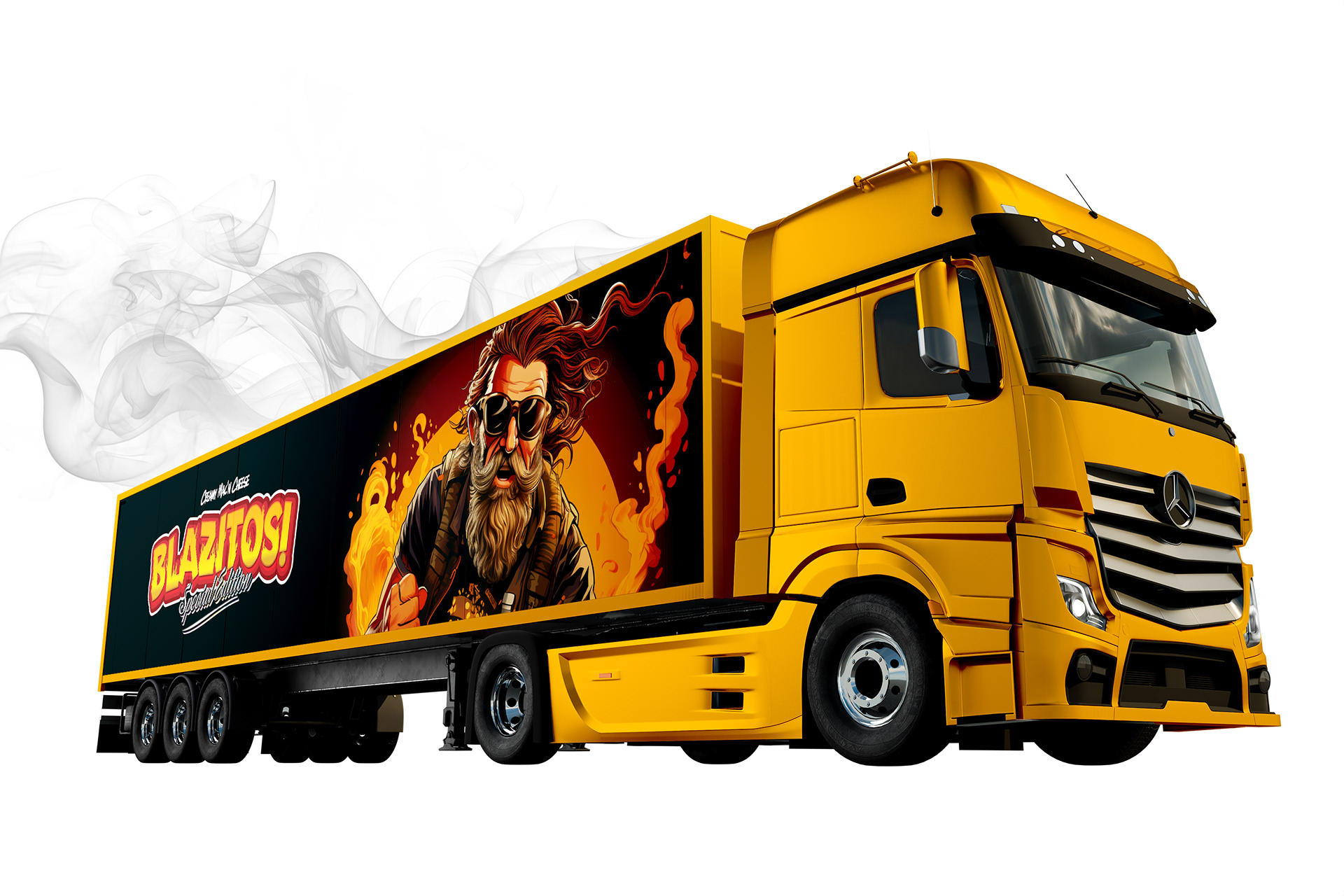
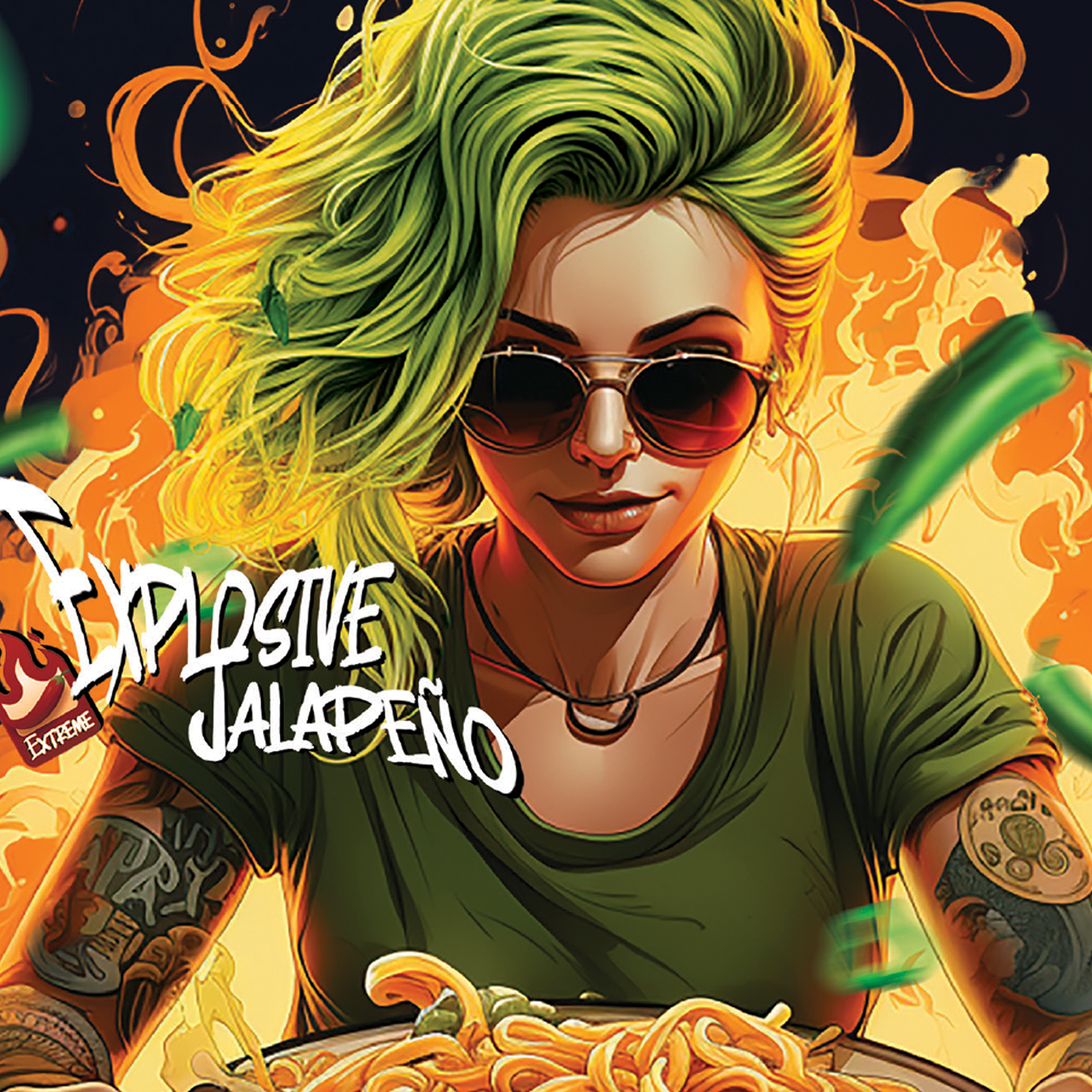
Illustration & Storytelling
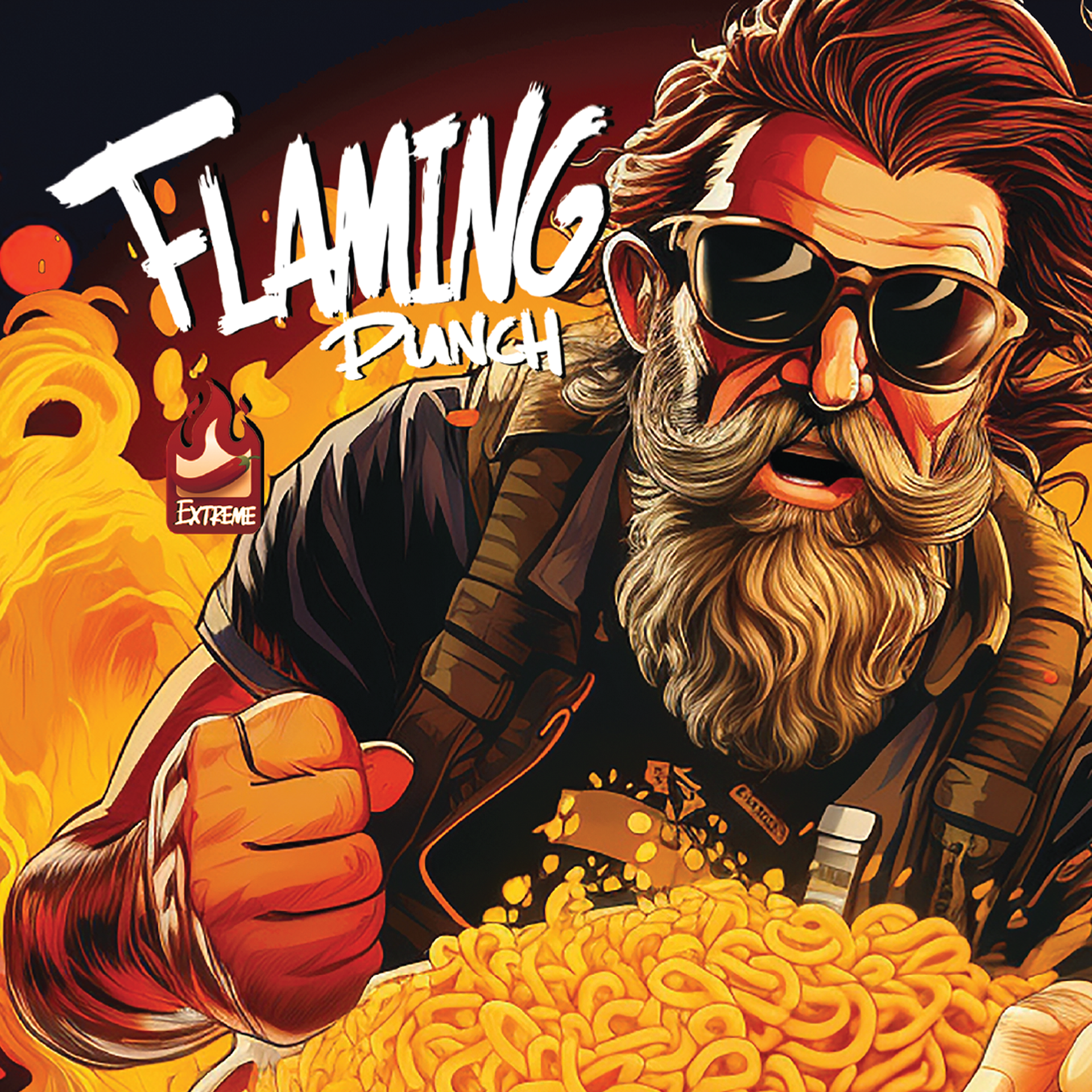
Custom illustrations of characters like “Flaming Punch” and “Explosive Jalapeño” were crafted using Midjourney to generate striking visuals. These were then refined and enhanced using Adobe Illustrator and Photoshop, showcasing the skillful integration of AI tools with traditional design software. These personas embody the brand's tough and fiery identity, making the mac 'n cheese not just a meal but a daring challenge. The storytelling invites customers to embrace the heat and prove they’re up to the task.
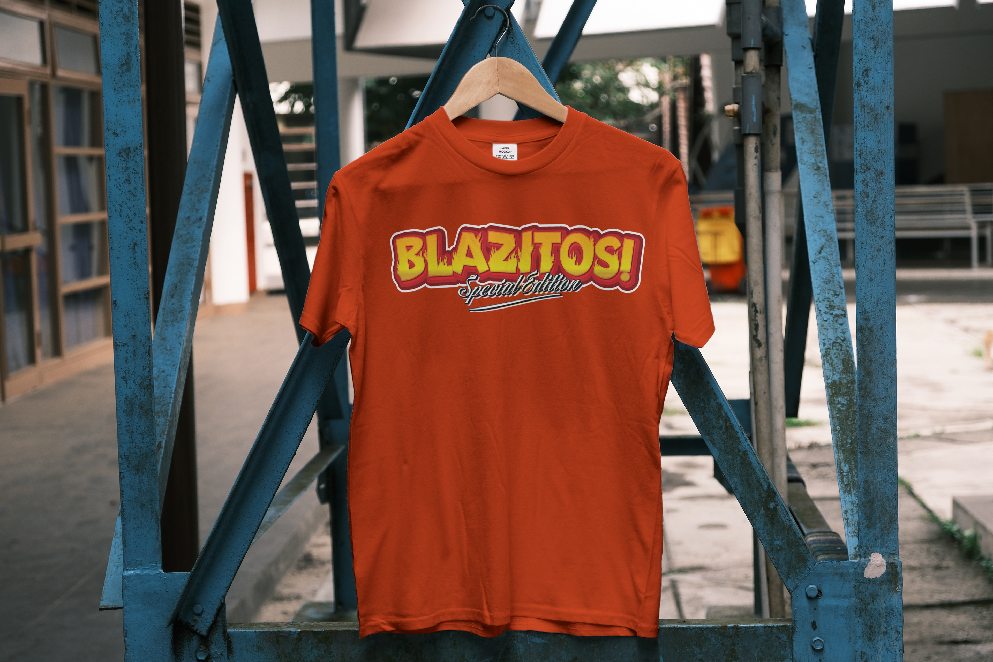
Brand Applications
Blazitos extends its bold branding across multiple touchpoints, from branded t-shirts and merchandise to an eye-catching truck wrap that embodies its rebellious spirit. These applications ensure the brand’s identity remains consistent and impactful, creating a lifestyle experience that resonates with its audience.