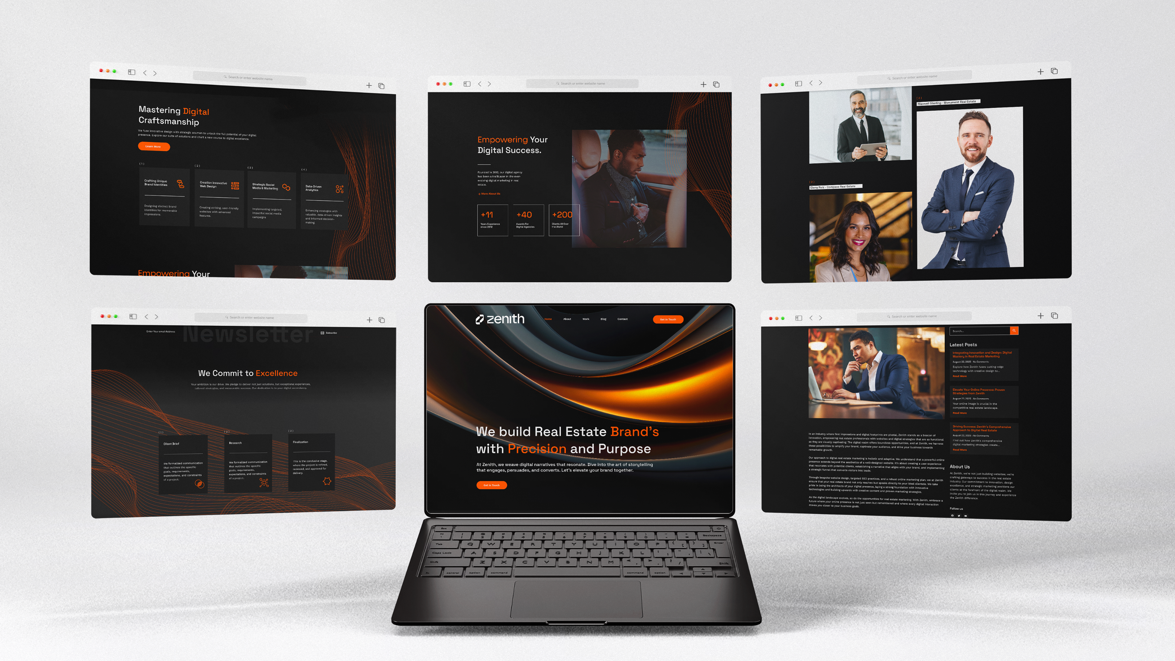
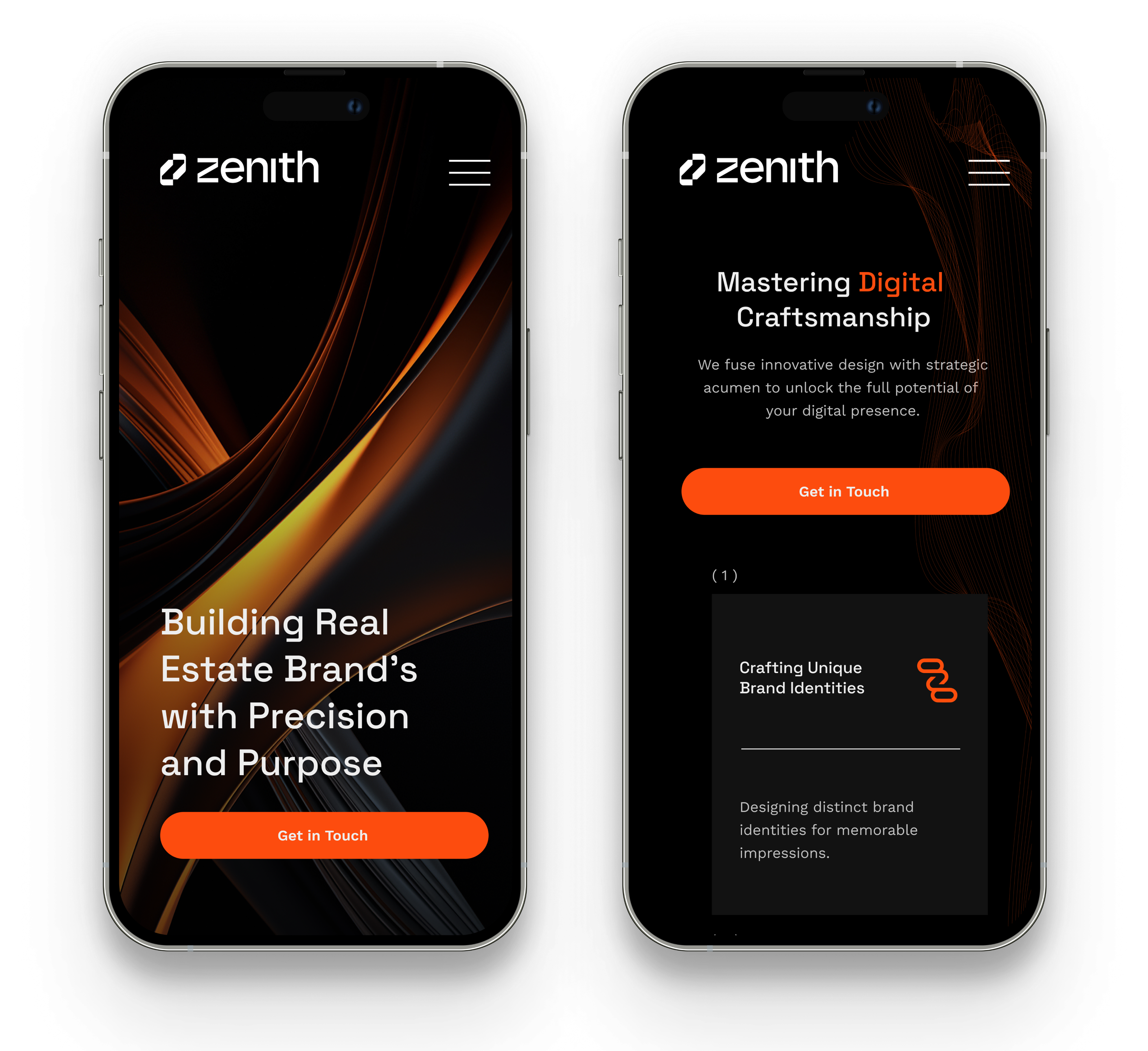
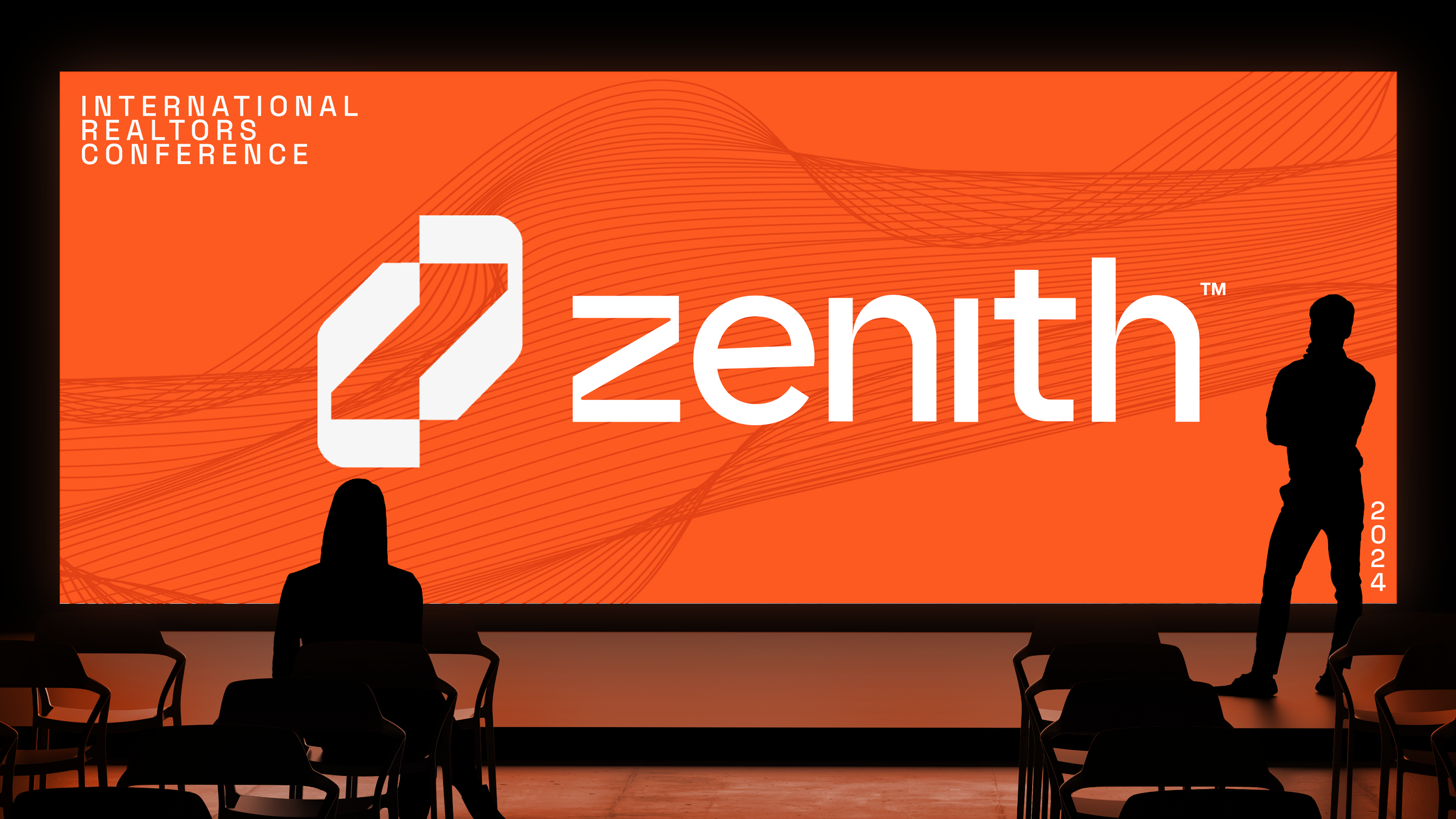
Brand Identity
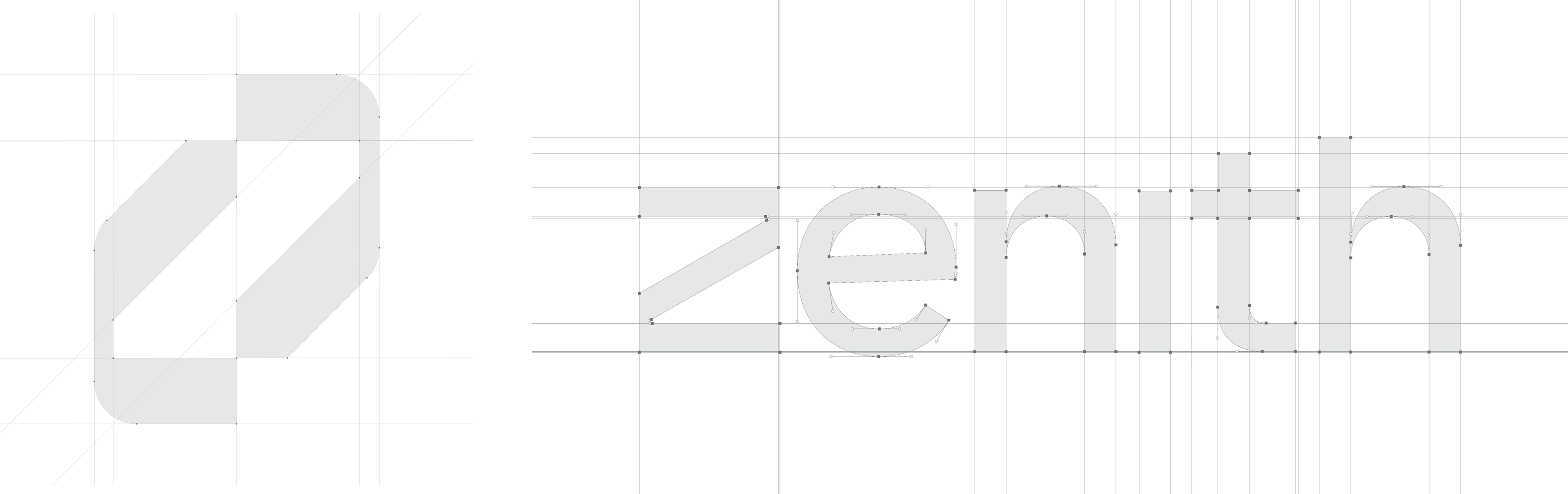
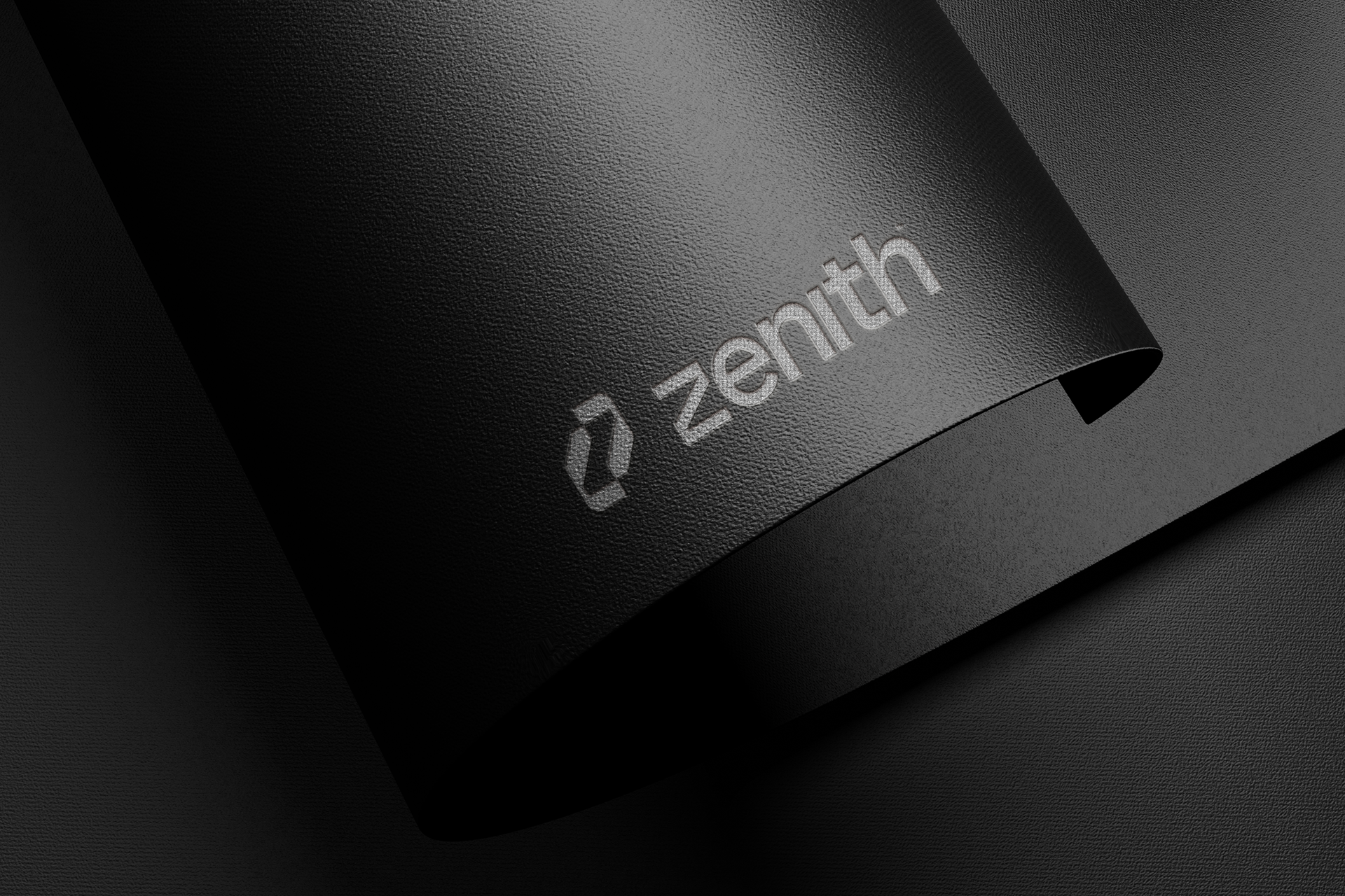
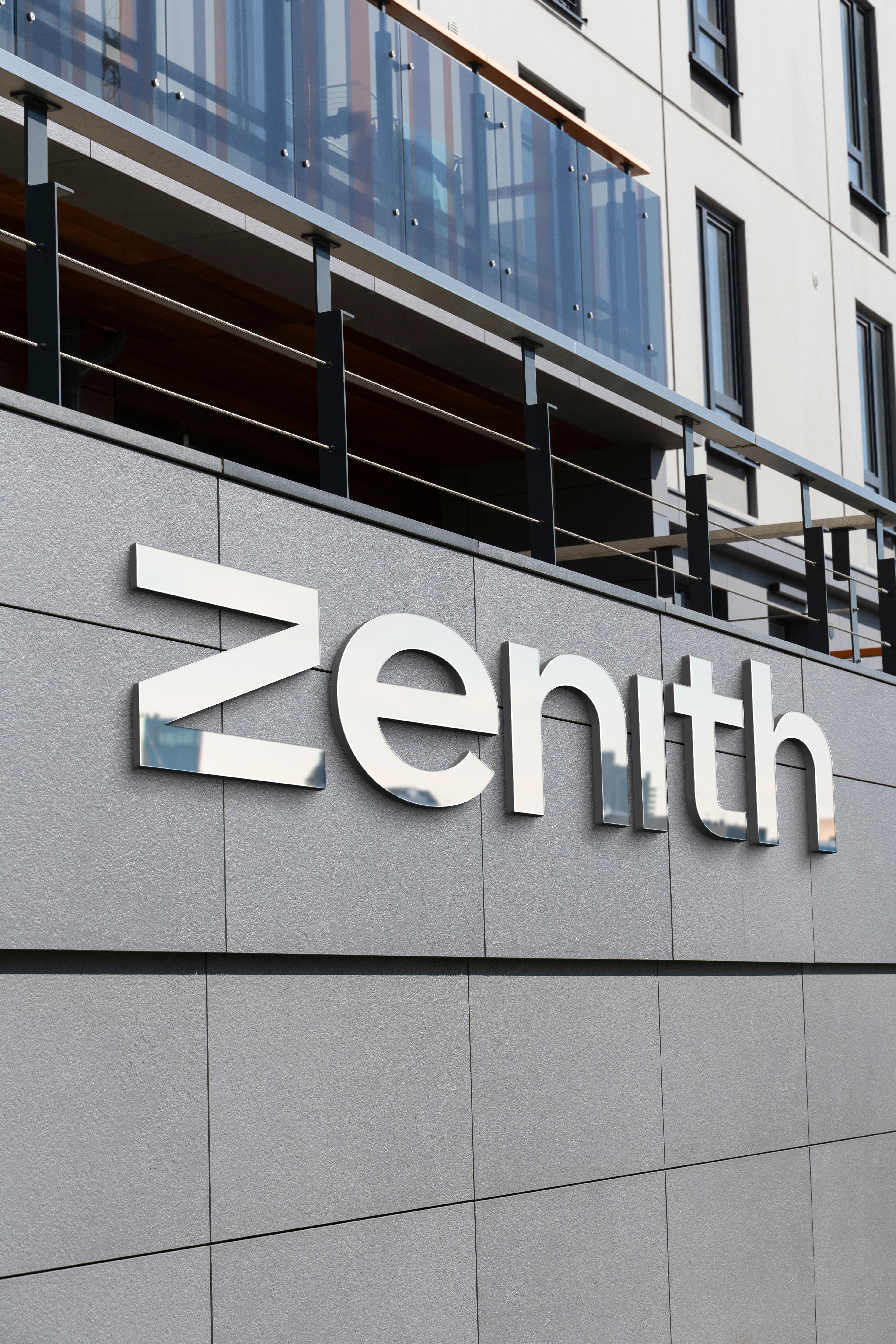
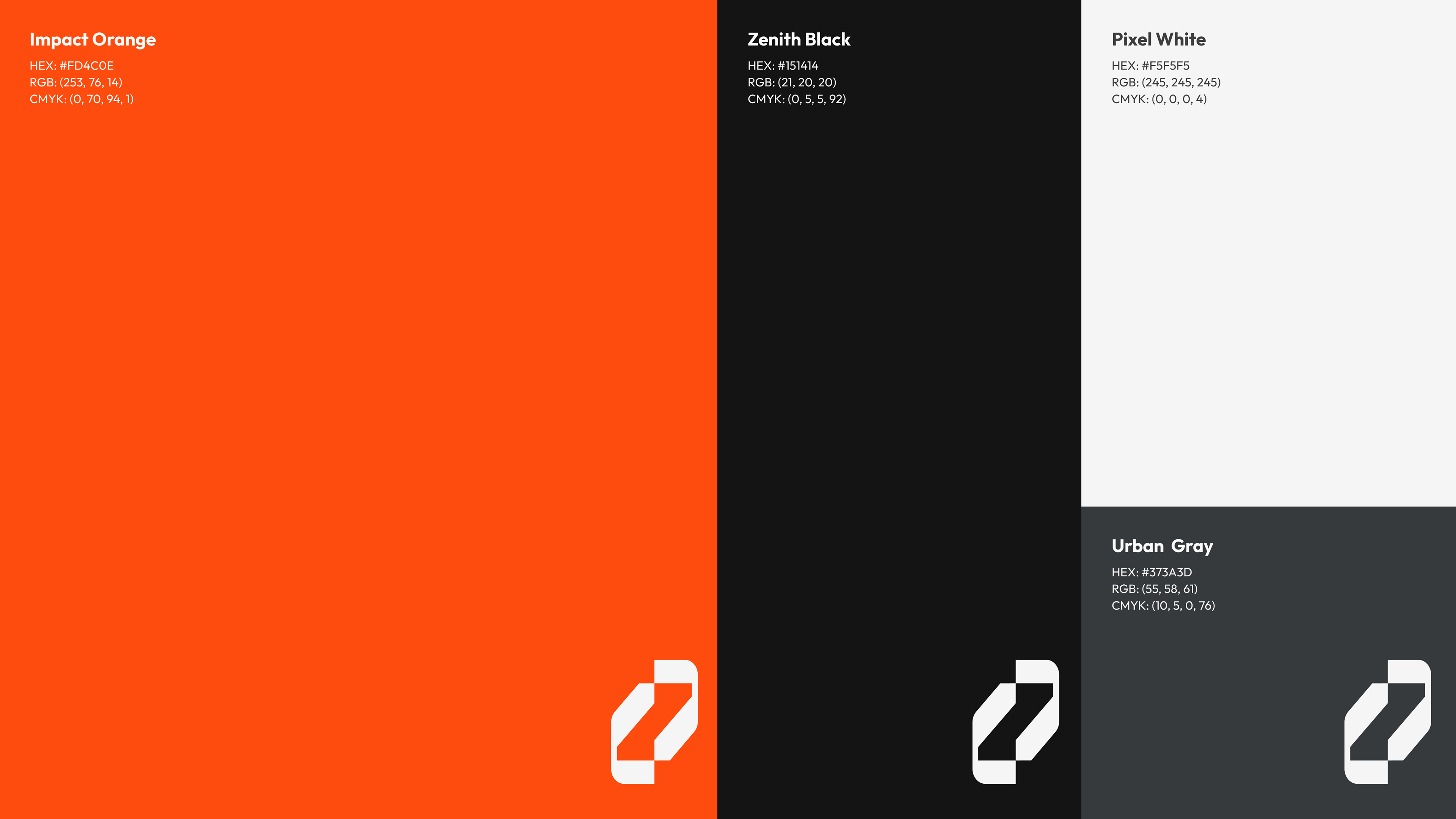
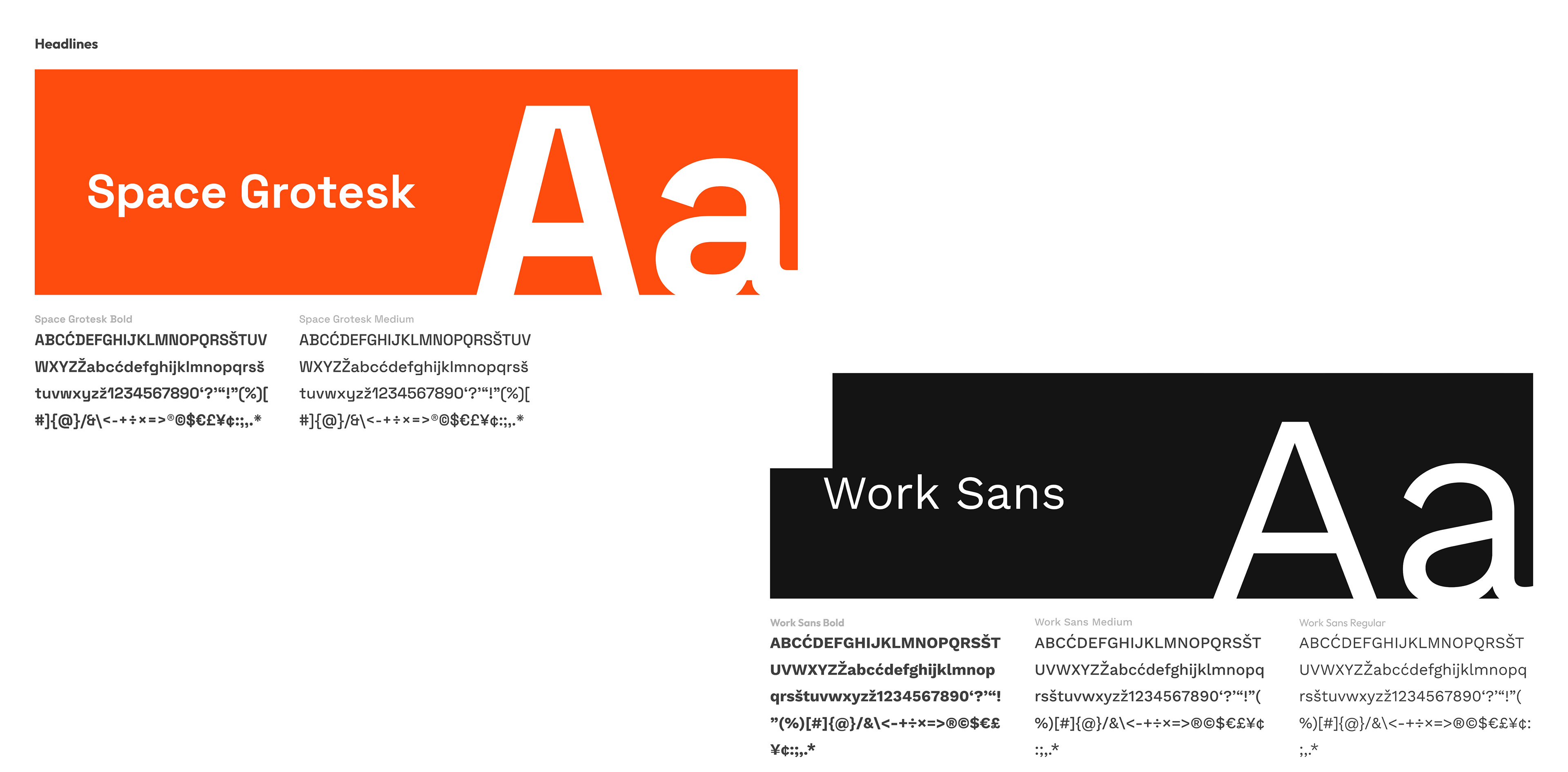
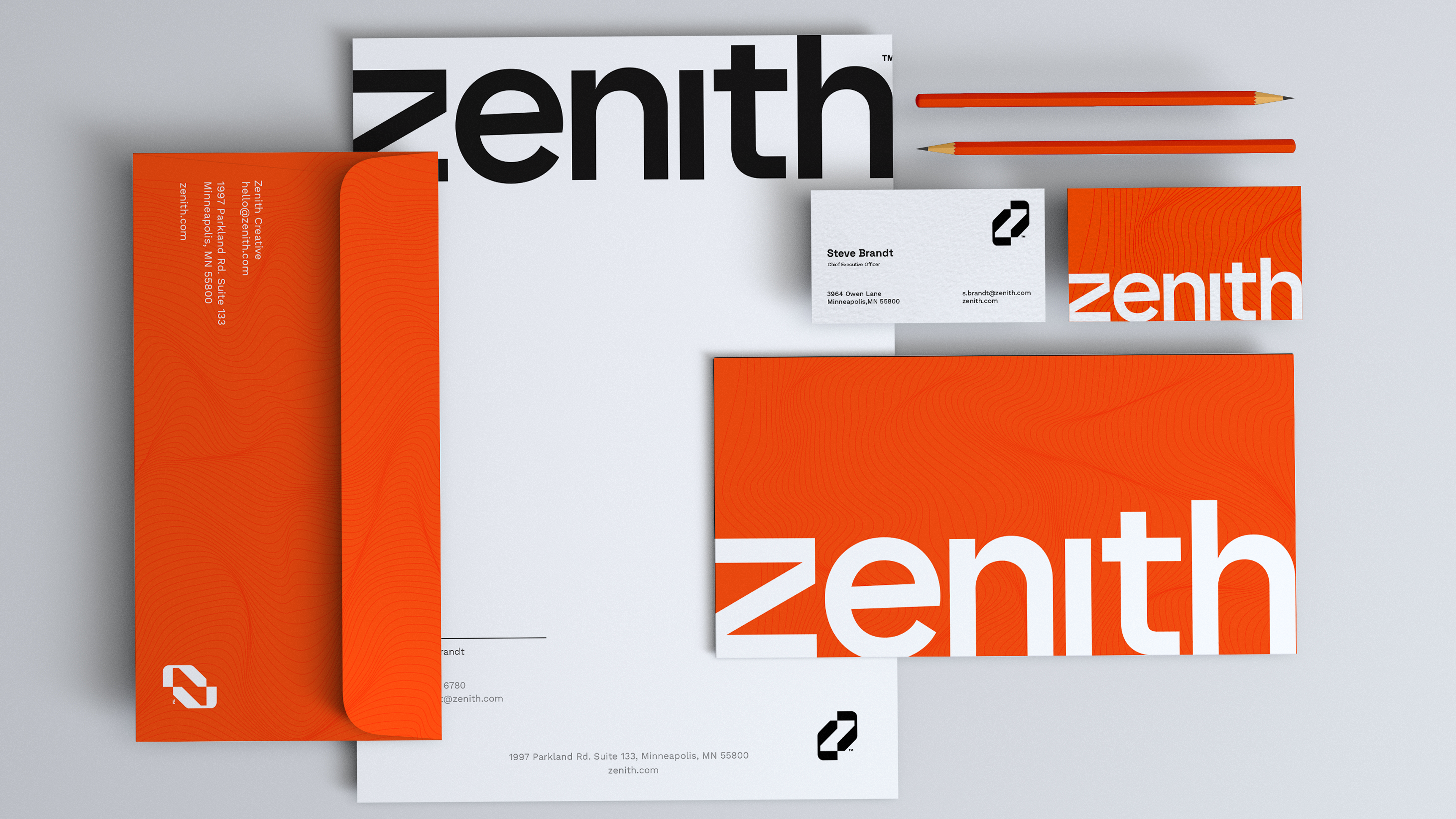
Zenith’s branding and logo together embody boldness, modernity, and innovation in the traditional field of real estate. The logo design uses symmetry to create balance and a sense of professionalism, while the principle of common ground ensures the "Z" feels cohesive and intuitive, symbolizing growth, trust, and creativity. The vibrant orange and black color palette was chosen to ensure high visibility and to represent the intersection of innovation and energy in a traditional industry. The typography—Space Grotesk for its modern and forward-thinking appeal, paired with Work Sans for approachability—supports clear communication and enhances readability. Clean, high-quality images were selected to reinforce the brand’s focus on professionalism and trust, maintaining a visually cohesive identity throughout.


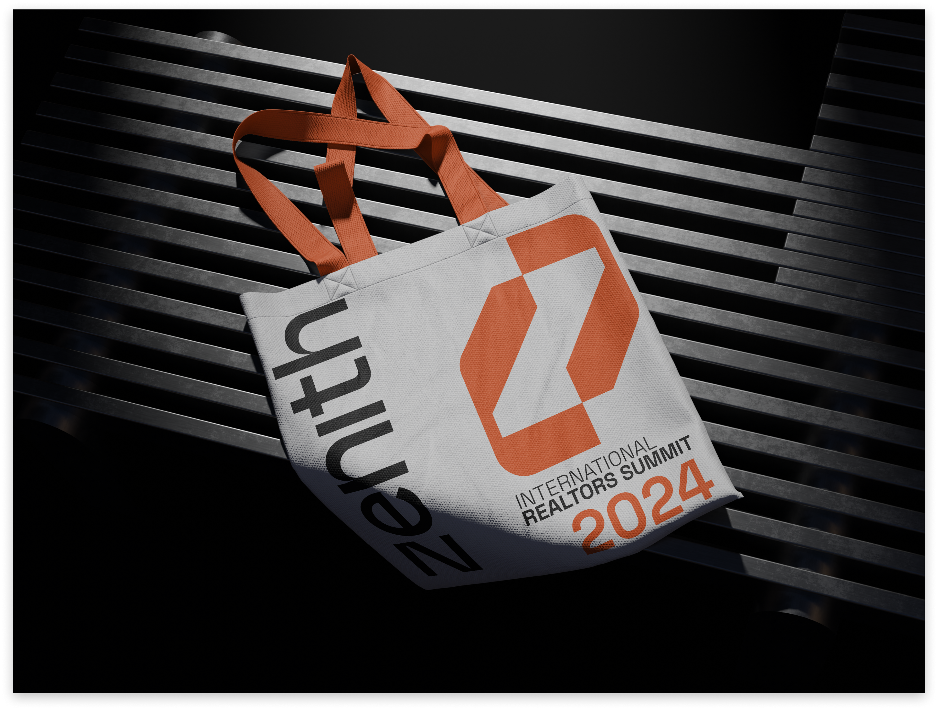
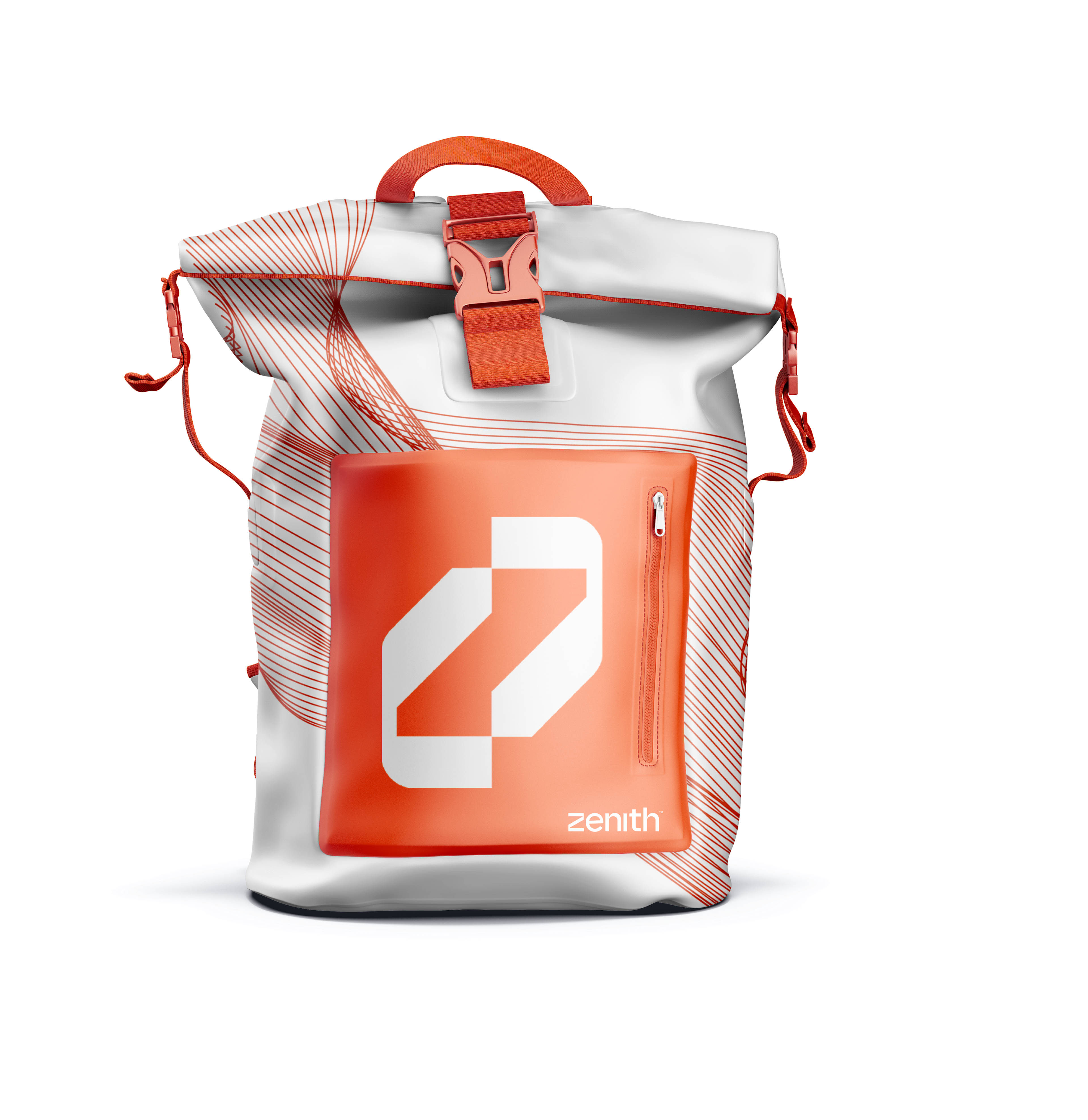
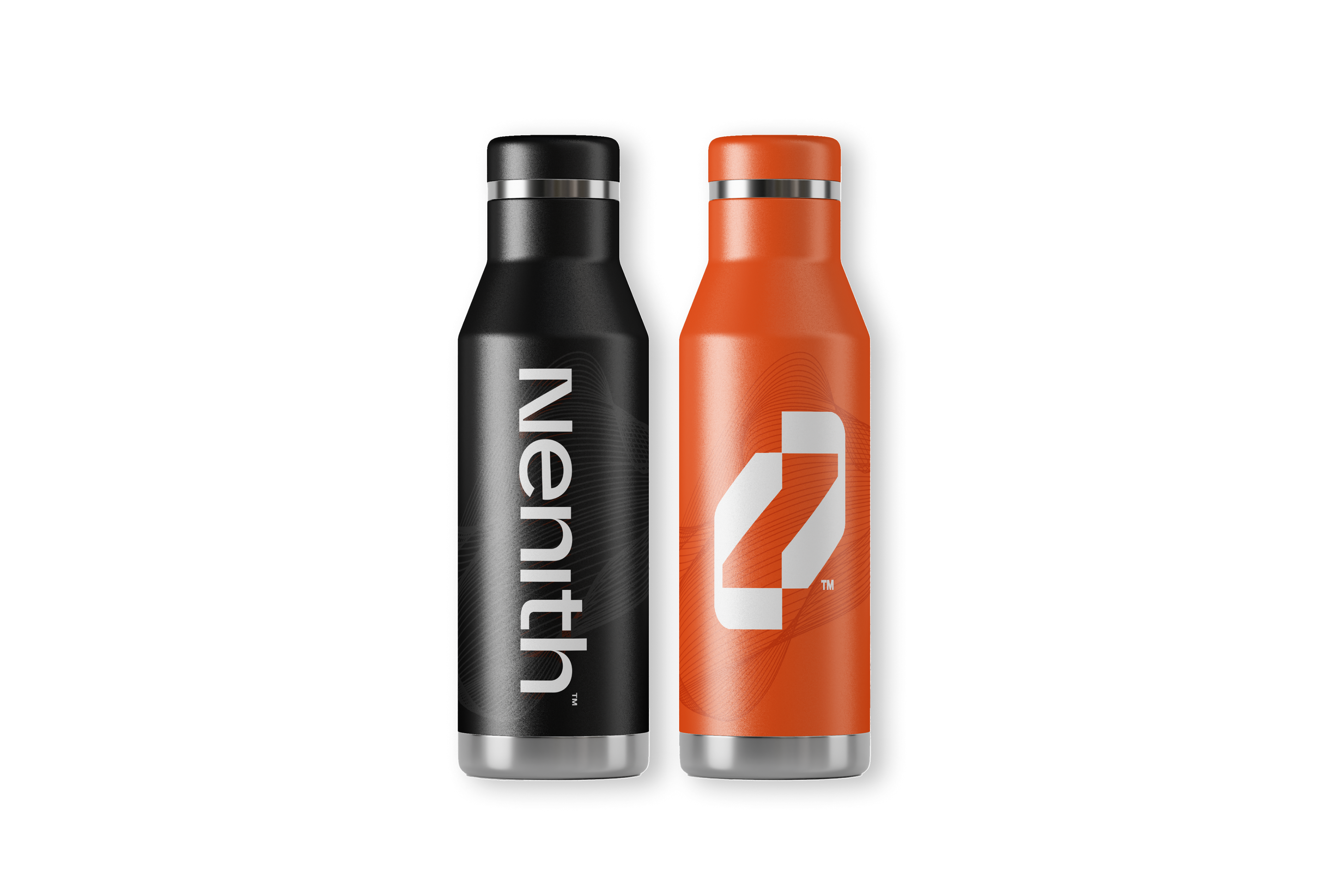
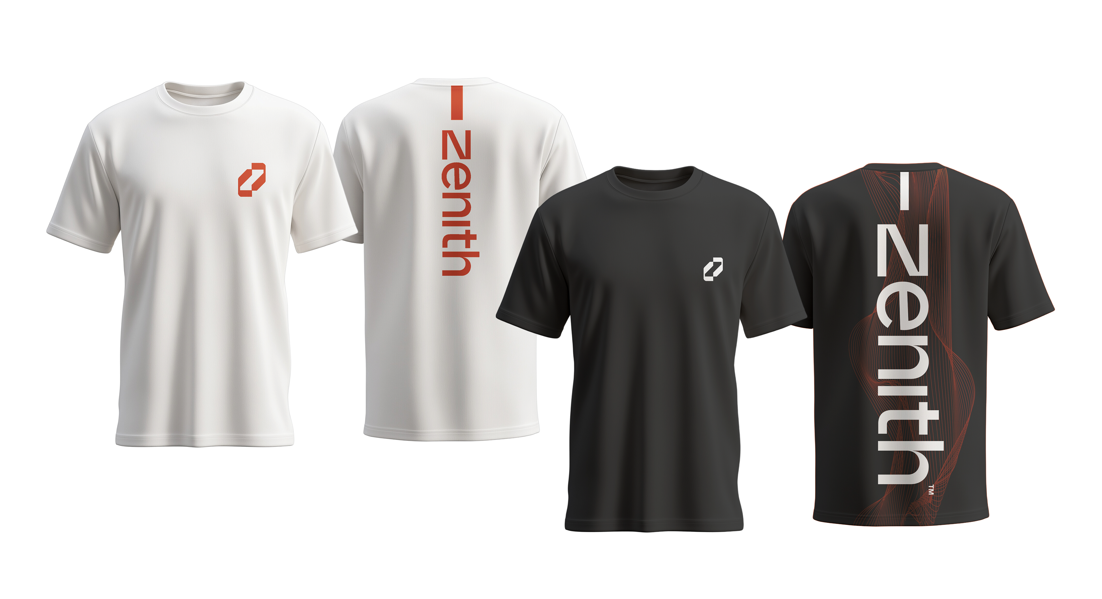
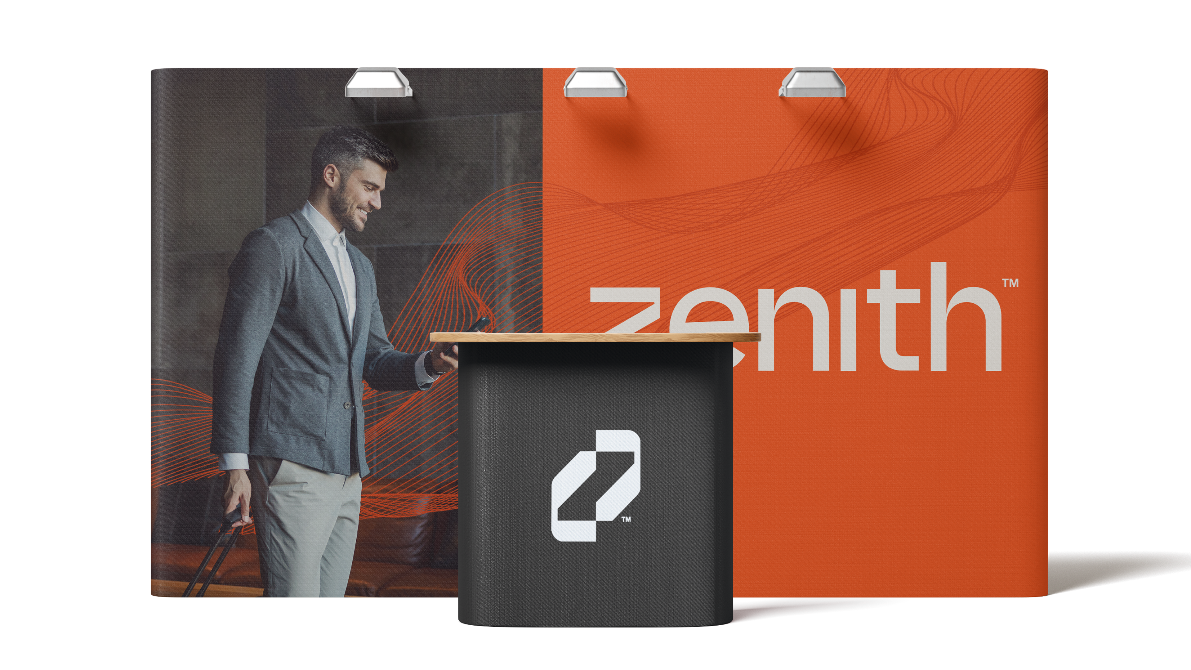
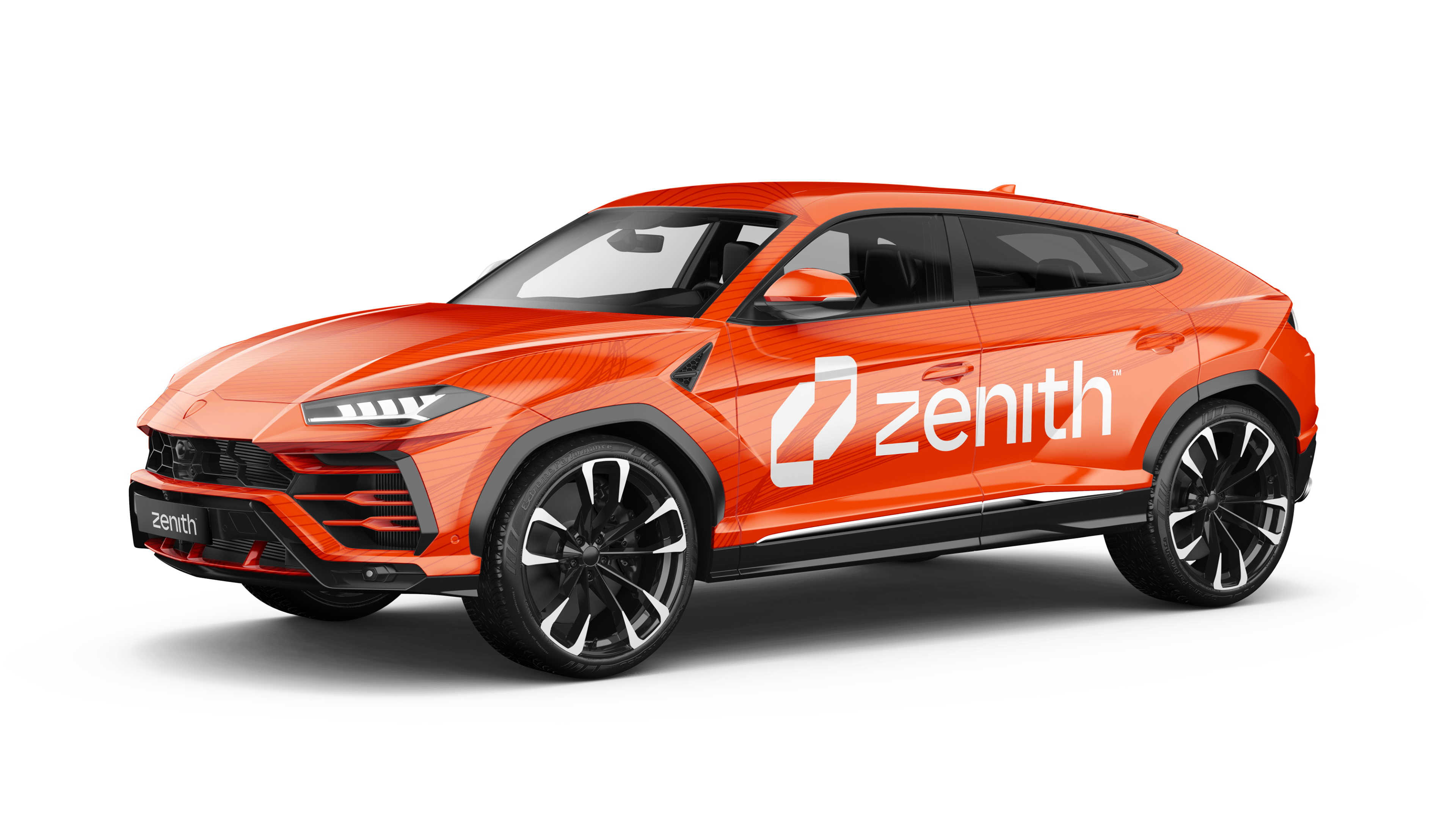
Brand Applications
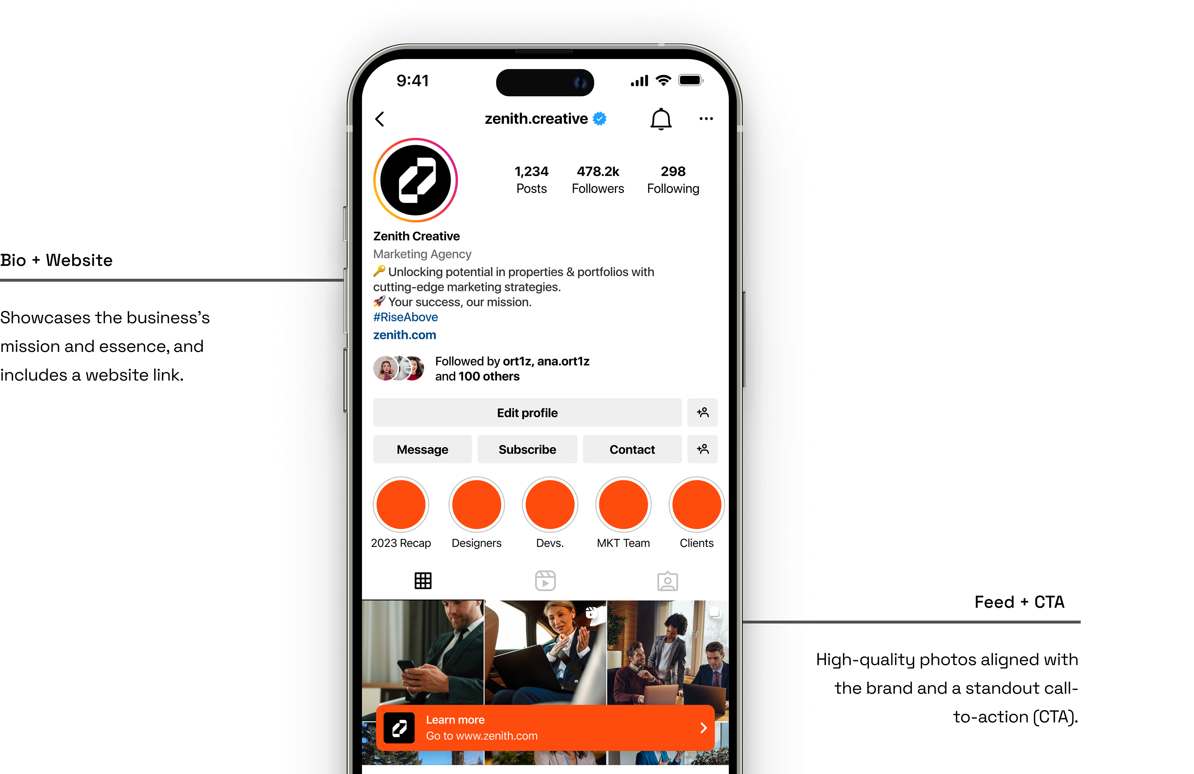
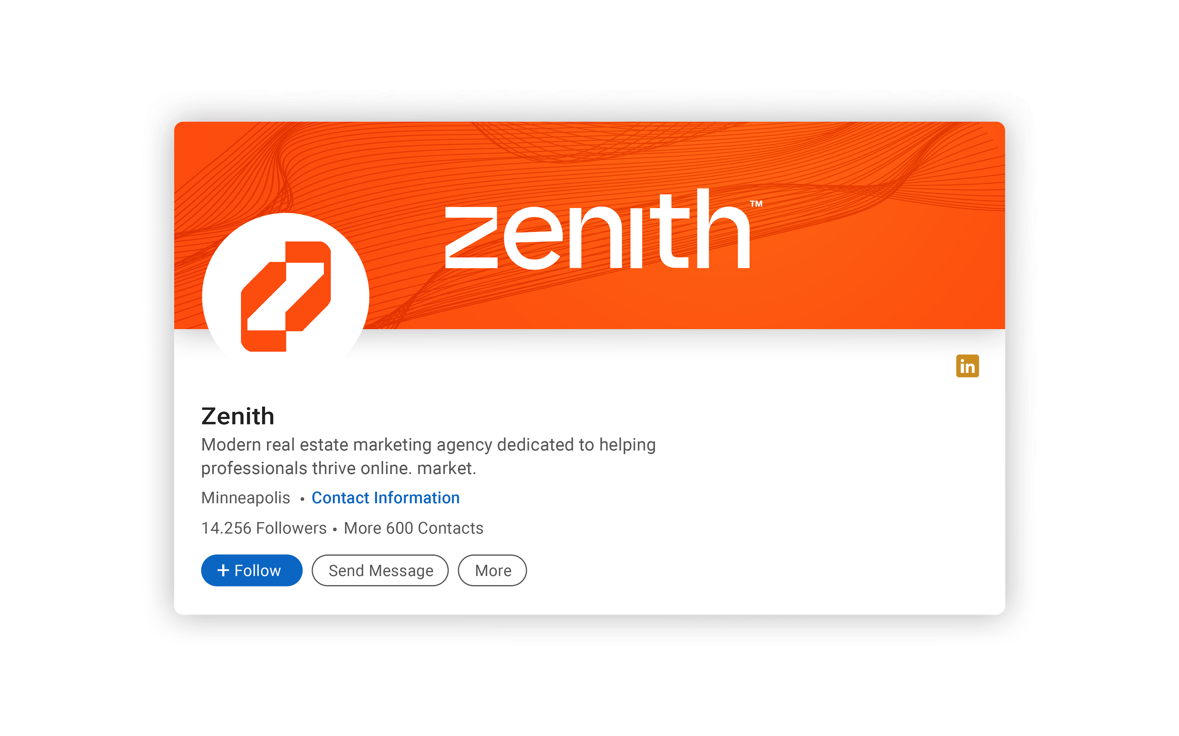
Zenith’s identity is applied across digital and physical touchpoints, from print materials and merchandise to outdoor advertising. Eye-catching designs for billboards, car wraps, and branded accessories reinforce a professional presence. These applications create a cohesive and impactful brand experience.
Marketing Strategies
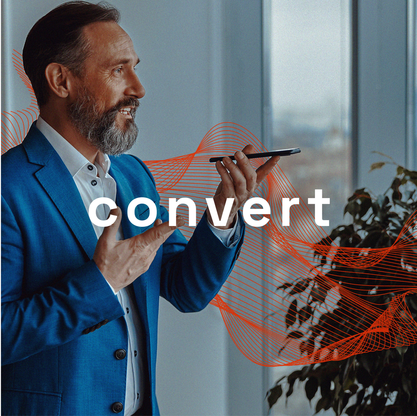
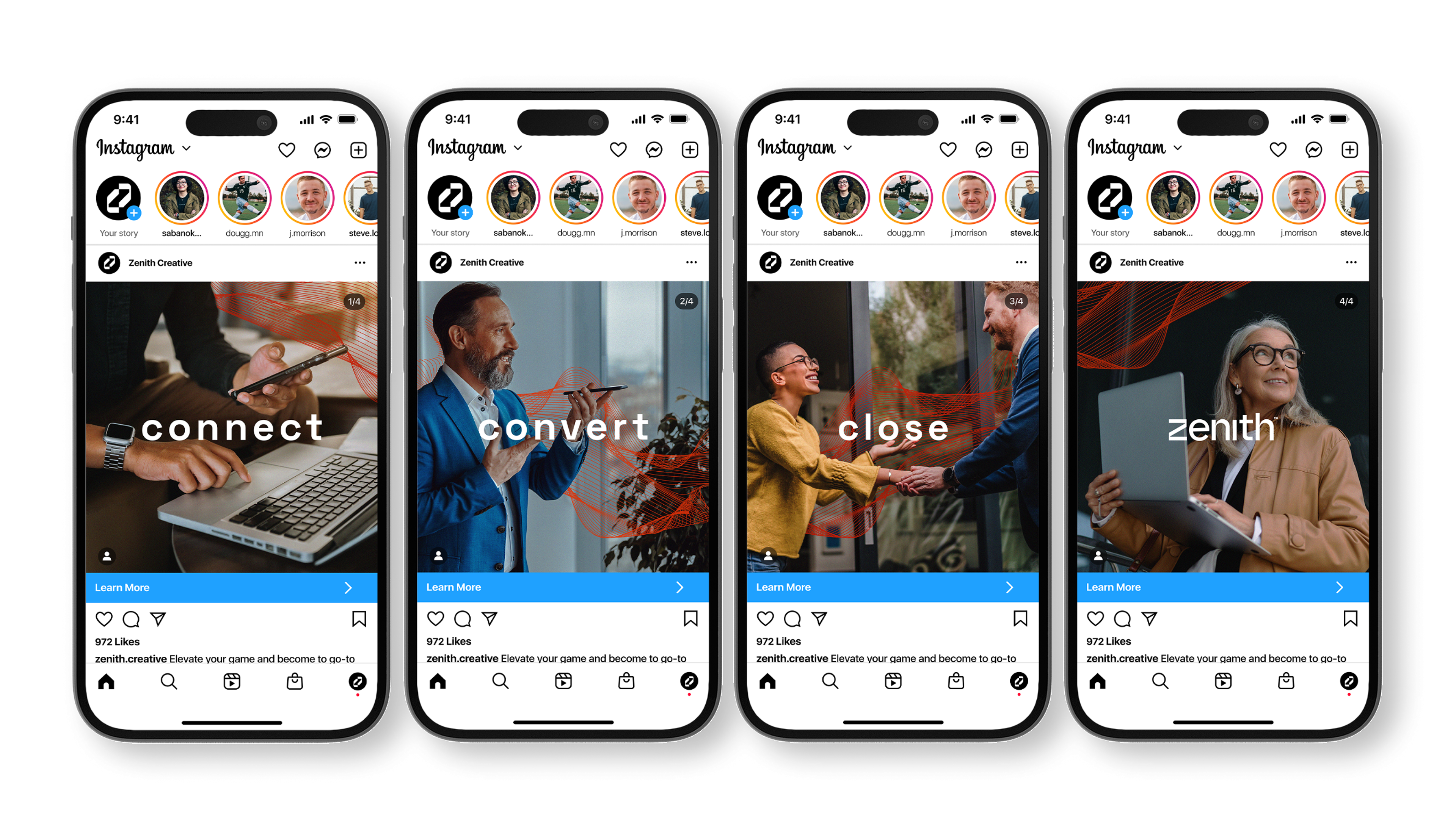
Zenith focuses on strategic tools like custom sales funnels, direct response marketing, and targeted ad campaigns. It integrates tailored content, SEO, and analytics to deliver real results for real estate agents. The approach is designed to maximize visibility, engagement, and lead conversion.